
Clients are enthusiastic entrepreneur brothers from Pune, selling German tech sliding, net, and mesh-based mechanical window fittings. Expected basic branding, website, and promotion material.
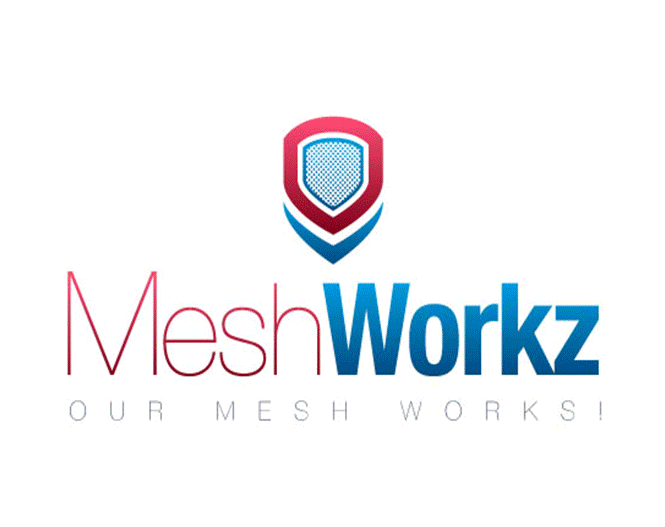
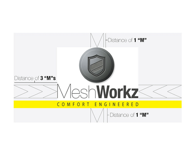

We began with the brand name and added a Z to the end in order to get a .com domain name for the website, and it also worked out because it gave the name an interesting German twist. The next job was the logo, which was designed in the shape of a shield, with mesh across it to highlight the sense of protection and security which we wanted the brand to talk about. We designed a Brand Manual for them, and the same German affinity was followed because of the German tech the product is based on. The Brochure we designed was made in a Vertical 3 – fold style, with a smart and chic look.
The client wanted a full grey colour palette, but we suggested an addition of a dash of yellow to make it look balanced as well as lively and to break monotony. The brand language came out quite sorted.
Okay then what happened: The brand language we set for Meshworkz (and for that matter, any brand we touch) came out so solid and workable, the client is still using the same pattern of design (even when we are not doing it for them) and no matter who designs it, it looks appealing! The brand is quite successful, as the superior product is backed by the correct brand communication style.


